
Today I would like to share several coloring techniques with you. If you want to see an image in a larger format, just click on the photo. Click on the browser's your back button to return to the blog.
For comparison purposes I colored the same image, on the same paper, with seven different products. I had considered using different papers (for example, watercolor paper for the watercoloring-like techniques), but decided that it would be more difficult for you to compare the techniques with that variable thrown in. So I tried out a few different papers with each of the techniques. The Copics bled too much on watercolor paper and cheaper white cardstock. The watercolor techniques caused the cheaper white cardstock to pill up a bit. So, the paper I chose was Bazzill Ultra Smooth White. It is a wonderful paper for use with Copic Markers, but it also holds up fairly well with water color techniques, though it does warp a little when it is gotten very wet. I don't think I would use it with wash techniques and watercolors, but it was just fine for this project.
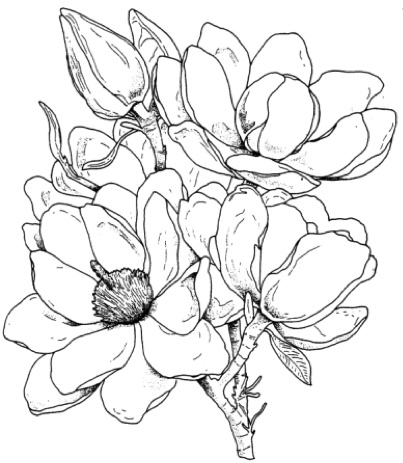
The image I chose was a beautiful large magnolia from FranticStamper's own line of stamps (148-05-N, $5.50) This beautiful image is large enough to showcase the various media; the image has enough room in the petals to be able to see the color gradations and blending. I loved coloring it!
The ink choice was a little trickier. I wanted to use the same ink for all of the different colorings so that the only variable would be the coloring media. I decided to try a few of my black ink pads with the media and see how each worked out. I tried Mememto, Versafine, Stazon, and Memories black ink pads. I didn't bother with my water-based or distress ink pads because I knew they wouldn't hold up to the water in watercolor techniques.
First, I used the side of my ink pads to create a bar of black ink on a piece of the Bazzill paper. I let them dry completely (the Versafine took the longest to dry.) Then I used my chosen media (distress ink with a water brush, colored pencil, and Copic Markers) which were a representative sampling of the various techniques I plan to use, and I made lines across the ink bars, scrubbing back and forth a bit across the bars.
Here are my results:
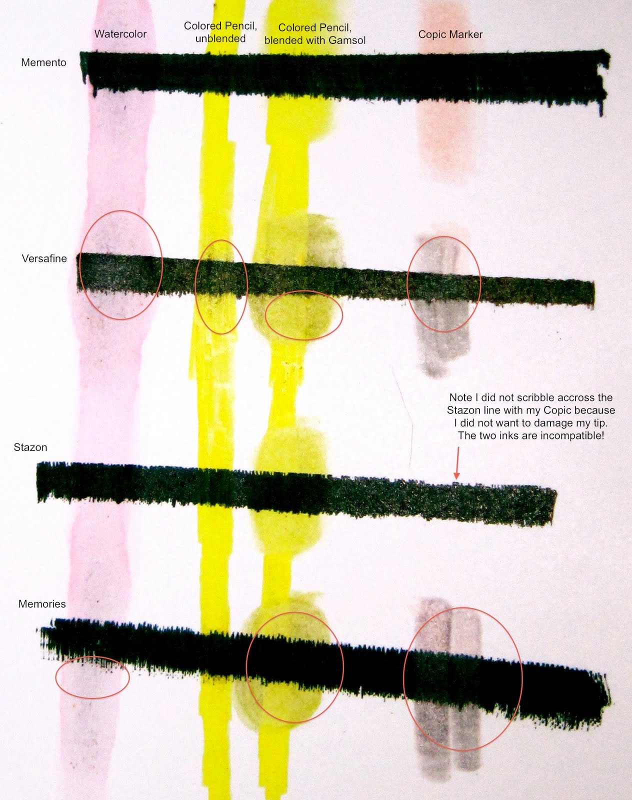
I was more than a little surprised to see how poorly the Versafine fared. It had been my go-to ink pad for a few years, and I didn't realize how easily it would smear, smudge, and run! Memories ink, which I had also used for years, did a little better, but really didn't hold up all that well with the mineral spirits or the Copics. The Stazon couldn't be used with the Copics since their inks are incompatible and the ink could damage the tip of the Copic marker. The clear winner was the Memento ink pad. It didn't really smear or run with any of the media.
So, I stamped seven copies of the mangolia with the Memento pad on quarter sheets of the Bazzill Ultra Smooth white paper and prepared to color each a different way.
Chalk
My first effort went into coloring the image with chalk. I chose to use pastel pencils because I had only a primary color chalk palette, where I had 24 different chalk pencils. One certainly could use a palette with sponge applicators for similar results, and would likely get better results with a broader palette. The pencils I used were CarbOthello pastels that I have had since college.
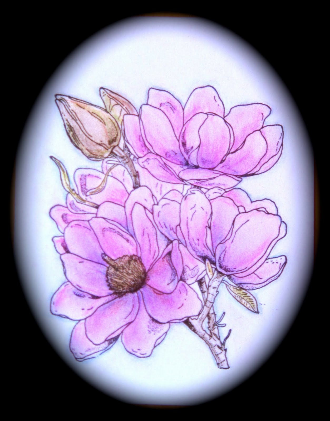
I started near the center of each flower and worked the chalk in as I went along, making sure to add shadows with darker chalk and blending it out lighter where I wanted highlights. I made sure to dust off (by blowing) the stray chalk as I went along to avoid getting it where I didn't want it. When I had the image completely colored, blended, and rubbed in (the chalk really needs to be rubbed into the paper or it will rub off later), I cleaned up stray chalk with a white vinyl eraser.
The color of pastels is somewhat subtle, and perhaps a little muted. For best results pastels should be set with a fixative to avoid future smudging. Coloring and blending are easy. The choice of colors is dependent on your choice of pastels, but most brands provide a more than adequate palette to enable good shading and blending. The pencils make it easy, too, to add texture to the leaves as desired.
Note that these pencils can also be used with water, but I didn't want to add water color-like techniques to this sample.
Distress Inks
Next, I decided to give watercoloring with Distress Inks a try. My color range was a little bit limited, having only Victorian Velvet, Worn Lipstick, and Spun Sugar in the pink range. There wasn't really a "dark" color to provide deep shadows, and none of the three colors really were right for the magnolia blooms.

Additionally, I didn't have reinkers, so I stamped my ink pads onto a clear acrylic block to create my palette for watercoloring. I picked up color from the palette with my water brush and painted the blooms. I made effort to ensure that any drops of color were pulled toward the center of the flower or toward areas of shadow to be sure that I wouldn't have dark areas left in unwanted places when the drops dried. I layered the color, using Spun Sugar last to brighten up the flowers. I used Victorian Velvet for my shadows, and worn lipstick, watered down considerably, as my main color.
The leaves and buds were done with Forest Moss, with a little bit of Spun Sugar mixed in in spots to make a brownish tone.
The color of this watercolor technique is very muted. The contrast is quite limited. Painting with the inks and getting depth and shadows is very difficult because the colors are just too similar. I would not chose to watercolor with this limited palette again unless I didn't care about adding shadows and highlights.
Colored Pencils and Mineral Spirits
One of my favorite coloring methods is coloring with colored pencils and then blending with odorless mineral spirits or GooGone™. With the colored pencils I had a lot of variety in colors so it was easy to get a lot of depth of color with shadows and highlights. I could blend smoothly with the solvent, and I could also add texture on top of the base colors.
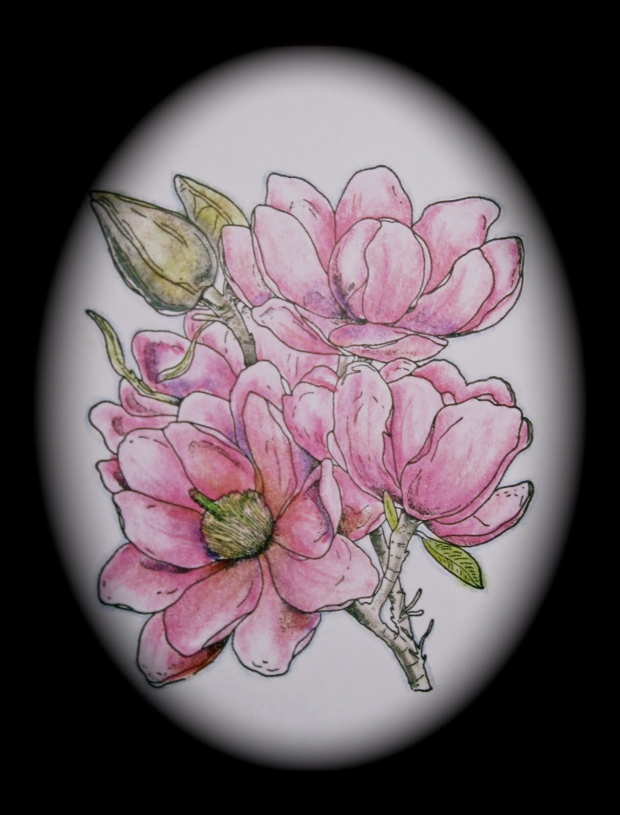
I laid down my base color around the areas that I would expect to have shadows and then blended it out toward the areas of highlight. I added in small amounts of darker colors in the shadow areas and blended those in, too, but minimally. After the colors were blended in I added lines to create the veins of the petals of the magnolia blossoms. I very lightly blended those in, leaving them mostly intact.
The colors of the colored pencils are more vibrant and more varied than those of the reinkers or the chalks. I had a great deal more depth in my colored image because of shadows and highlights. This remains one of my go-to coloring methods because the results are always wonderful.
Niji Pearlescent Watercolors
Of all the media I worked with, these were without a doubt the most difficult. They would be wonderful if I simply wanted a single shade of a single color, with a lot of pearlescent shimmer. However, used as watercolors to get depth and shading, they were much less effective. Even resorting to dry brush techniques to try to get darker shades really just didn't work. The paints don't flow as smoothly as regular watercolors.
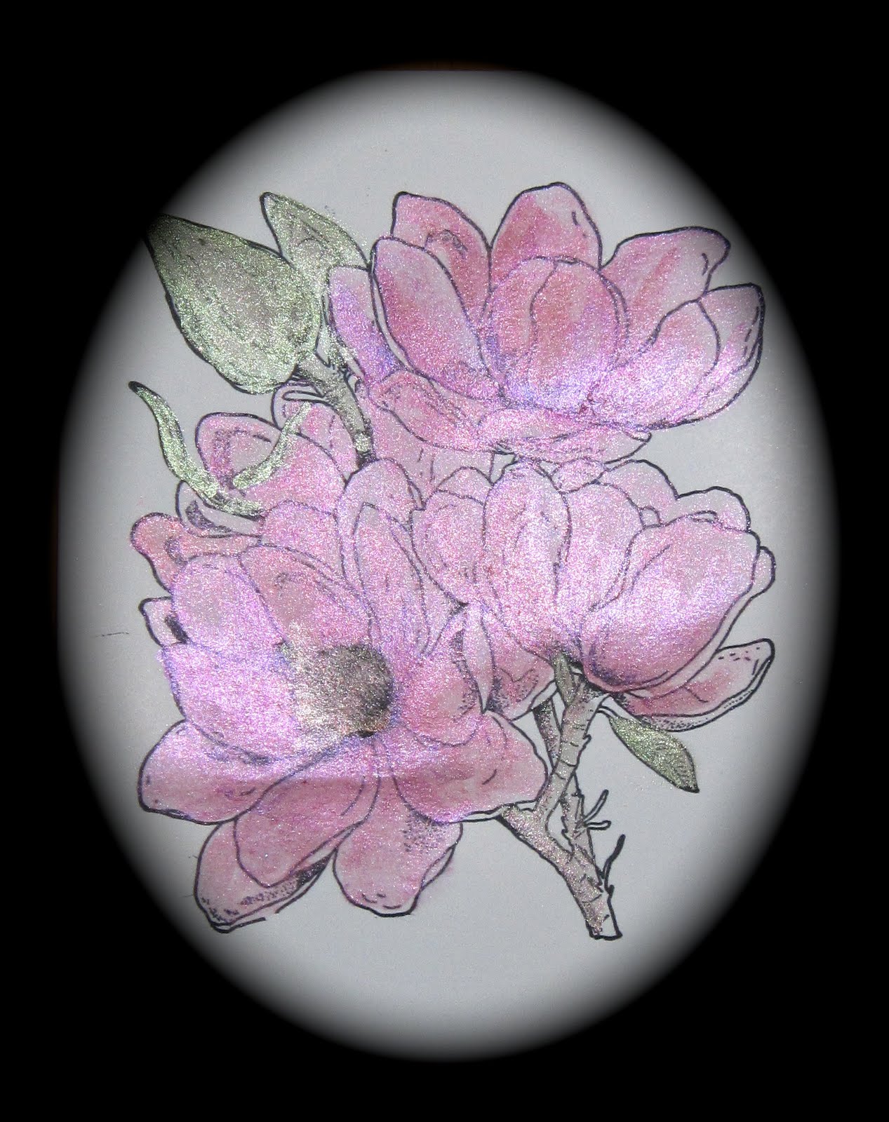
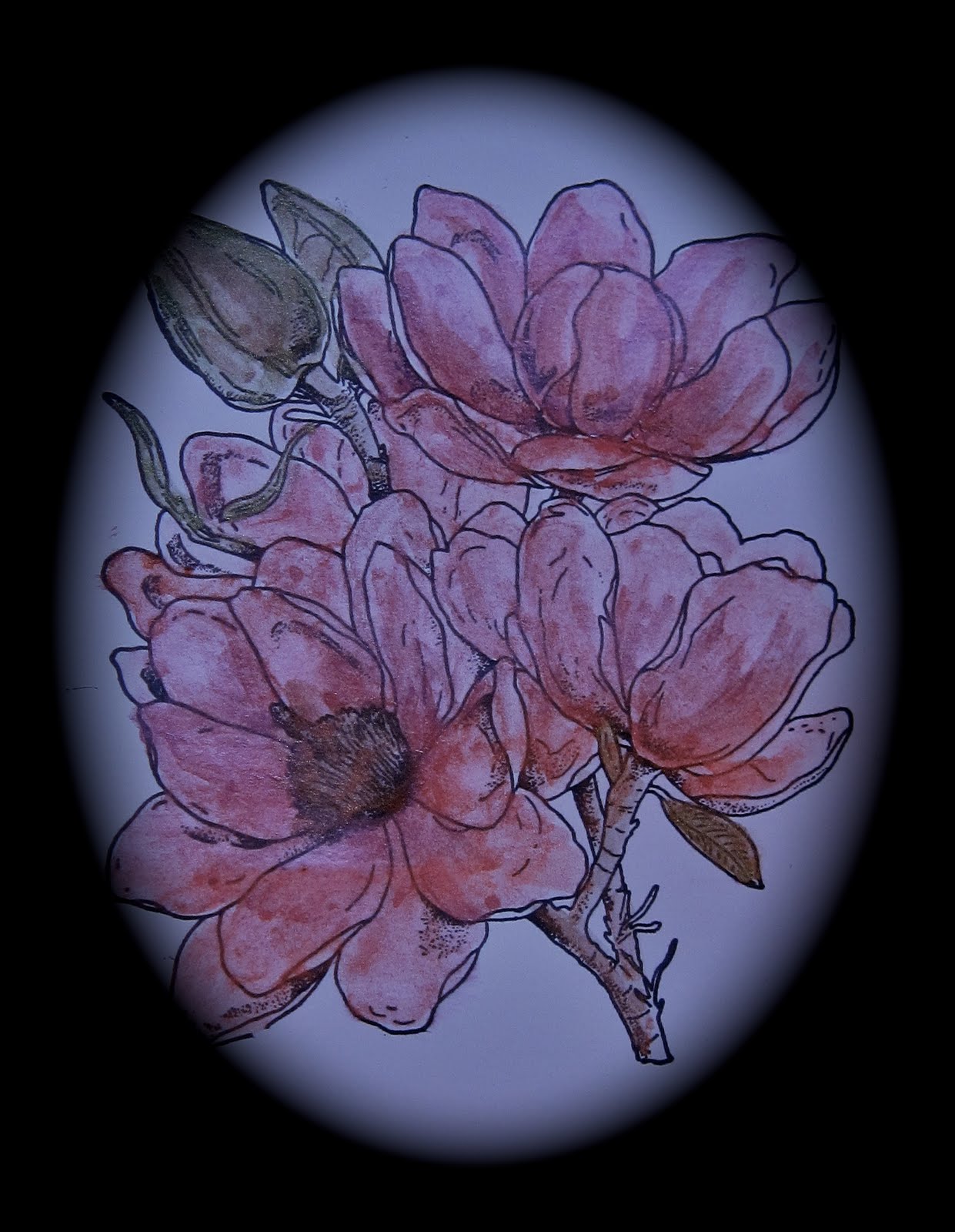
My set of Nijis had only a single shade of real pink. I used it, and a little bit of purple to shade. I used a couple of different greens and a little golden brown for the buds.
As difficult as it was to paint this image with the Nijis, it was even more difficult to get a photo of it. The amount of shine made using any strong light source impossible... the images were filled with glare. Photographing with an indirect light source completely misses the shimmer. I am sharing both failed images so you might get some idea of the results, even though neither photograph really works well.
Overall, I do like my Niji colors for some purposes, but I will stay away from trying to watercolor realistically with them.
Watercolor Pencils
I have had a set of Derwent watercolor pencils for years and have used them as one of my main tools for coloring images. I love the way they flow and blend. They offer the ease of colored pencils with the beauty of watercolor. They can be used directly on paper wet or dry, on wet or dry paper, as well.
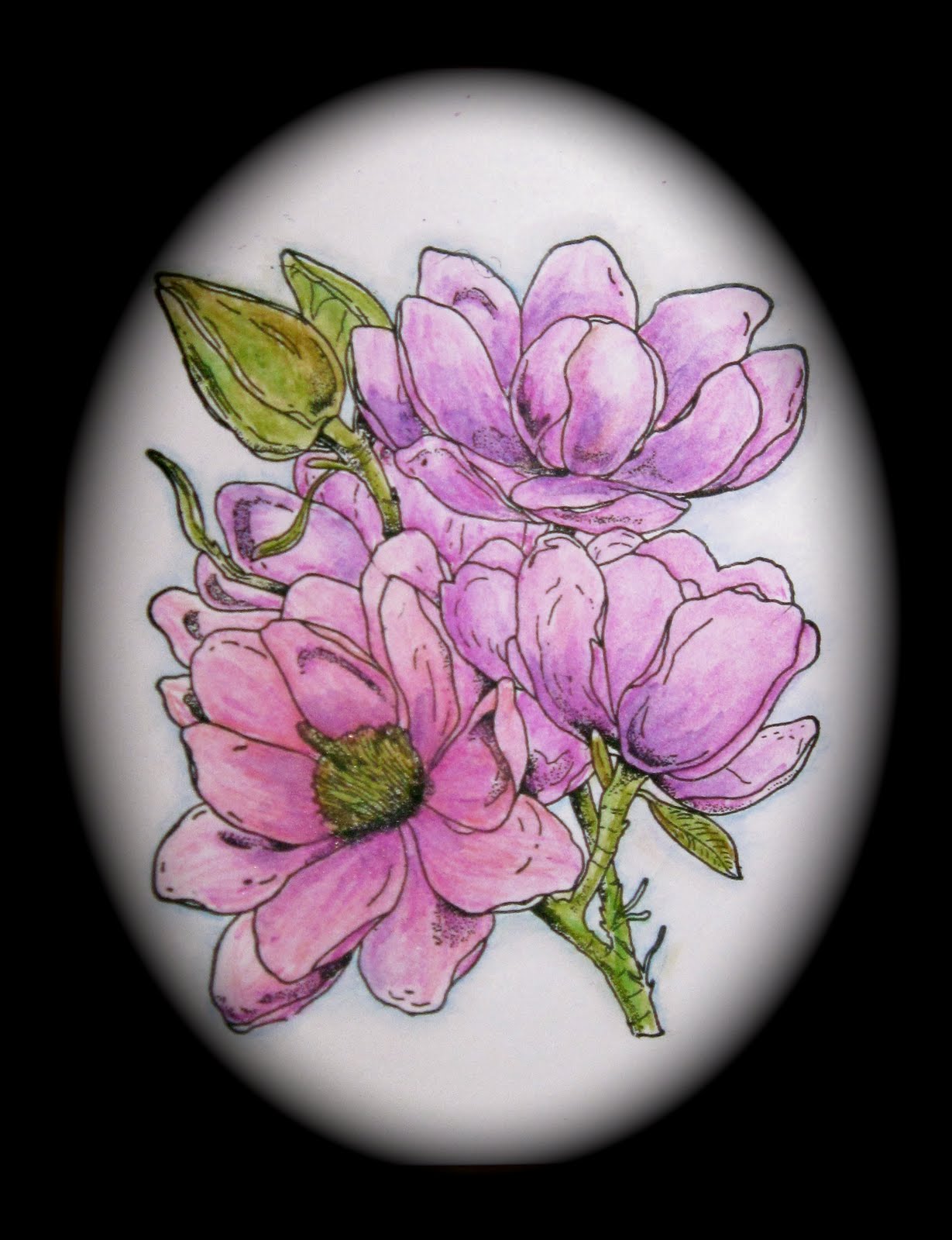
I colored a small area of each petal, dry pencil on dry paper, where I would want shadow, with my main color. Then, using a waterbrush, I spread the color toward the highlight areas. Once dried, I added a smaller amount of color in darker shades in the same area, and blended it out less, leaving it to look more like shadow. When I was finished blending the flower and the buds, and when the image was dry, I added a little texture using the pencils without blending out to give the effect of veins in the petals of the magnolia.
As with all watercolor techniques, though, part of what makes the image so beautiful is the slightly unexpected and uncontrolled way the pigment moves in the water, where it pools. So even with the efforts to spread the water in a particular direction, this still has the looseness of a watercoloring, which I love. No matter what other media I may discover and enjoy, I will always go back to my watercolor pencils.
Tombow Markers
Markers could be colored directly onto the image, but I find that images colored that way are too dark, too flat, and almost too much like a "coloring book" for my tastes. But that doesn't mean that I couldn't use markers to color the image! I found that since Tombows are water-based markers, they can be used to produce a palette for watercoloring simply by scribbling them onto something suitable for a palette... I used an acrylic block.
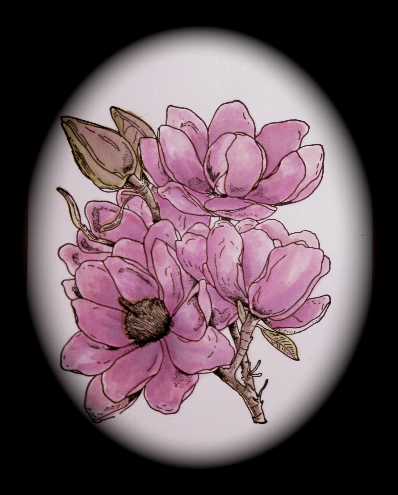
I simply scribbled a quarter-sized spot of each of the colors I planned to use, and then picked them up with a waterbrush and painted them onto the image like I would have with any watercolor. I found that the color spread best on a wet base, so I painted water onto my image where I intended to add color. I then added my color as desired, being careful to not let pigmented water pool where I wanted highlights.
I used a variety of markers to get the color variations I wanted, belnding some on the palette, and some on the paper. They blended easily and were easy to use to get the effect I was after. The one drawback was that I had to frequently reload the palette with color, and the color did tend to bead up quite a bit on the block.
Though this was a fairly effective technique, I wouldn't make it one of my go-to methods of coloring an image.
Copics
This was my first-ever coloring effort with Copic markers. I had never attempted to use them before, so I have to admit I was a little intimidated at first. But I found them to be wonderful to work with. The color goes on smoothly and blends almost effortlessly. The colors are vibrant yet have enough variations from light to dark to be able to produce shadows and highlights with great color gradation between them.
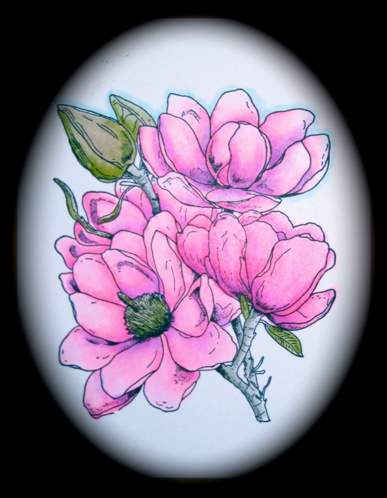
I did read quite a bit about Copic techniques before using them, so I understood that it is best to layer on color to darken colors than to try to blend out darker colors into light areas. I also knew that it was best to work on smaller areas at a time to avoid lines. I decided to work on each flower, one petal at a time. I colored the whole petal with my lightest color, then adding the next darker color in from the shadow areas, blending with the lighest color, and then adding darker shadow colors until I reached the effect I was after. I then moved on to the next petal, and then the next flower. I colored the stems and buds last.
I have to tell you, I am totally in love with these markers. They are VERY different from the other media I have used before, including those I have discussed here. But I believe they are well worth the learning curve they require. They blend better than anything I have ever used before. The colors are more vibrant and alive than with any other media I've used. On the downside, they have a pretty significant cost associated with them; each pen is a bit of an investment. But from my very first attempt at coloring with them and with the projects I've colored since, I have not once been sorry about the money I invested in them. The experience of coloring with these pens is like no other!
A little note of warning, though. These pens do bleed through most papers and cardstocks. In order to blend thoroughly the paper really needs to get saturated with the ink. Make sure you color on a surface that won't be bothered by the bleed-through. And remember that if you want to use the image you've colored on a card, it probably should be added to the card as a layer. Also be aware of any ink you use with these markers. If you plan to draw on or around your image be sure to use a Copic Multiliner or a Memento marker. Don't use other alcohol or solvent-based products with your Copics. If you've made the investment, you will want to protect it.
Thanks for checking out my various attempts at coloring this fantastic image! I had a great deal of fun trying different media and seeing how they compared.
Smiles,
Kathy