Sunday, February 19, 2012

Sketch Sunday: February 19, 2012


We hope you will enjoy the card sketch this week.


Some of our design team took the sketch challenge and want to share their cards with you.

First up we have a card from Jennifer Willis using the Frantic Stamper Cling-Mounted Rubber Stamp - Large Rose.


For her take on the sketch, Sharon Jeffs decided to create a rustic card with a country type feel. She used a soot stamping technique to stamp Frantic Stamper's Cling-Mounted Rubber Stamp - Pine #1, then also colored the patterned paper (Kaisercraft Vintage Timeless) using Distress inks and a soft dry brush technique.


Next we have a card from Kathy Berger. She used the Go Kreate! Sitting Boo die to create a bear and added a Go Kreate die cut frame to create the focal point of her card. (Kathy and Jane Larsson will have more to say about these dies in a product review this coming Thursday.) But what we think really made the card is the beautiful lace background, created by heat embossing detailed white embossing powder on an image stamped with the Frantic Stamper Cling-Mounted Rubber Stamp - Lace Background! It really looks like lace and gives a perfect soft touch to this baby card.


Next, Linda Phinney used the elements of the layout in a portrait orientation instead of a landscape to make her lovely stamp-free card. Using Hot Off the Press Floral Boutique 3-D paper tole foil die cuts and foam tape, she created a wonderful dimensional focal point for her card. With just the right touch of bling this card really stands out, don't you agree?


And lastly, we have a beautiful card from Jane Larsson. She used the gorgeous Frantic Stamper Cling-Mounted Rubber Stamp - Peacock Pair, colored with Copic Sketch markers for the focus of her card.


We hope you have enjoyed this sketch and our DT interpretations of it. We hope you will be inspired to create something of your own with our sketch. If you do, please share it with us! Just email your photo to FranticStamperSketchPhotos@yahoo.com and we'll add it to this blog entry.

Friday, February 17, 2012

Je t'aime card (DT member Sharon Jeffs)

by Sharon Jeffs


I have a special affinity to the Kaisercraft range of products.   After all its an Aussie just like like I am! Plus, they have some absolutely beautiful ranges to play with that suit all different preferences.  I chose to create my card using the ‘Sweet Nothings’ range.  I used their 6 by 6 paper pad so that I could add as much detail to my card as possible.

I began with a 6 inch square base is a kind of sage color green then added a trimmed piece from the ‘Sweet nothings’ range to it. The centre image is from the Frantic Stamper range of stamps and is called "Magnolia". (You can find it here.)I love this stamp a lot because it can be used in so many different ways like cutting out the centre section and using only that.  I also cut a scalloped circle to matt it from the same paper range.

To assemble my card, I first inked all the edges with a Brown Sepia color ink. I added a strip of hessian ribbon down the centre for a bit of a vintage feel and a few Prima rosettes to add that extra little bit.  Finally I stamped a word stamp (also from the Frantic Stamper range) and attached that to the bottom right of my card.

Thursday, February 16, 2012

Technique Thursday: Paper Topiary By Memory Box


Today we would like to share a beautiful paper rose topiary from Memory Box Dies. The artist used Pinwheel Posie die (MBC-DIE-98270), Scalloped Posie die (MBC-DIE-98269) and Small Pinwheel Posie die (MBC-DIE-98271).


Check out these great dies and many others at www.franticstamper.com

Wednesday, February 15, 2012

Warehouse Wednesday: And the madness continues...


And the madness continues...

CHA madness is upon us! The UPS lady commented today on how many packages we are receiving these days. You think? LOL!! It's a major challenge getting everything checked in, organized and uploaded onto the website, all the while filling pre-orders AND keeping up with orders. But you know what they say, "keeps us out of trouble", right?

What's in store? A WHOLE LOT!!!

  • We've just received 2 new collections from KaiserCraft: Tiny Woods (cute as a button woodsy theme) and These Days (a traditional victorian floral line).
  • October Afternoon has finally delivered the much awaited Sassparilla line, but they did not ship several items…. we hope to get this on the site by this weekend.
  • Cheery Lynn has just revealed their NEWEST dies!! Our shipment is due in next week. I'm adding the items to the site right now, and they should be ready to order by this afternoon.
  • The newest collection from We-R-Memory keepers is here too. It's called Baby Mine.
  • Also, we have a new collection from Webster's pages that needs to be uploaded.
  • We're also working on uploading the rest of the new Spellbinder dies expected to arrive mid-March.
  • We've just received 2 new collections from KaiserCraft: Tiny Woods (cute as a button woodsy theme) and These Days (a traditional victorian floral line).
  • October Afternoon has finally delivered the much awaited Sassparilla line, but they did not ship several items…. we hope to get this on the site by this weekend.
  • Cheery Lynn has just revealed their NEWEST dies!! Our shipment is due in next week. I'm adding the items to the site right now, and they should be ready to order by this afternoon.
  • The newest collection from We-R-Memory keepers is here too. It's called Baby Mine.
  • Also, we have a new collection from Webster's pages that needs to be uploaded.
  • We're also working on uploading the rest of the new Spellbinder dies expected to arrive mid-March.
There is so much more to be done….. but orders come first, and we have to concentrate our time there.

Please be sure to keep checking the new products area on our site:
http://www.franticstamper.com/newest-products.html and watch for new products being added daily.

Hugs,
-Fran
www.franticstamper.com

Tuesday, February 14, 2012

Coloring Corner: Selecting Paper for Copic Markers


Last week we looked at how to chose the right ink for your coloring projects, with a focus on Copic markers. As important as the ink is, the paper you choose is also critical to the success of your project, so today we will discuss some aspects of assuring your paper will work well with your coloring media.

To do our test, for illustrative purposes, we chose 5 different card stocks. We knew we were going to be using Copic markers so we specifically avoided watercolor paper and coated papers. The watercolor paper, by its very nature, is too absorbent for use with Copics; it will just soak in too much ink. Coated papers, especially clay coated, should be avoided because the coating media can damage the tips of the Copic markers. With clay coatings, for example, small pieces of clay can be lifted off the paper and embed themselves between the fibers of the brush, causing the ink to flow poorly, and clogging the tip.

The five card-stocks we chose were:
  • Bazzill Ultra Smooth white card-stock
  • Bazzill Ultra Smooth ivory card-stock
  • Bazzill Coconut Swirl card-stock
  • Georgia Pacific basic white card-stock
  • LaBlanche Specialty Stamping Paper


To set up the test I cut 4" squares of each of the different card-stocks. I then stamped 6 circles on each piece of card stock, and hand-drew a rectangle on each as well. I also hand-drew a circle within one of the circles. For my ink I used Memento Tuxedo black ink, via a pad for my stamped image and then with a marker for my hand-drawings.

Note: for all of my coloring tests I do anticipate bleed-through of color to the back of my paper, especially given that some of my tests require supersaturation. I made sure to have a clean sheet of plain white copier paper under my samples at all times.

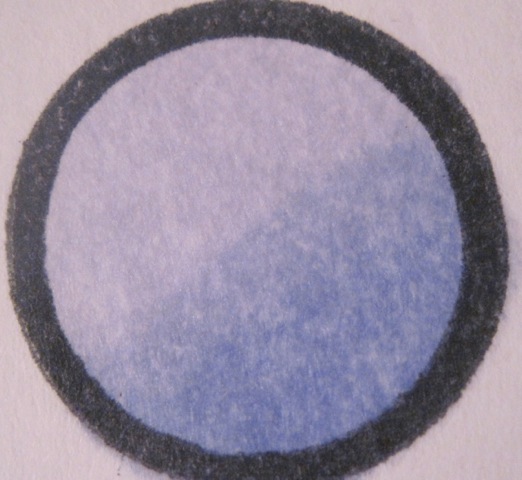
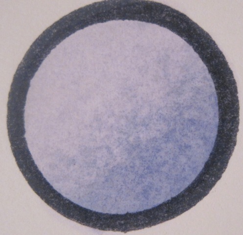
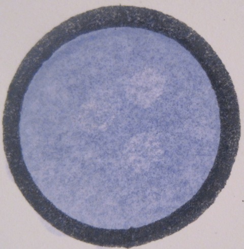
My first test is to see if I can saturate the paper (which is necessary for smooth blending) and smoothly color an image (no blotches). All of the papers with the exception of the LaBlanche performed reasonably well for this test. I laid down a good cover of ink, and continued to lay down color until the circle looked even and well saturated.

The LaBlanche card stock didn't work at all on this first test, so I won't be showing any further tests with it. The Copic ink beaded up and smeared around, never getting absorbed into the paper. The Georgia Pacific stock seemed to be working fairly well, but it dried somewhat splotchy. The three inks from Bazzill saturated well, with good even coverage. All of the papers bled through to the back except for the LaBlanche.

LaBlanche
Georgia-pacific
Bazzill Coconut Swirl
Bazzill Ivory
Bazzill White Ultrasmooth


The second test was to supersaturate the paper to check for feathering. I colored the drawn circle completely without touching the line. I then continued to add color and more color until the paper was super saturated. The Georgia Pacific card stock feathered quickly and badly, as did the Bazzill Coconut Swirl. The two Bazzill Ultra-smooth cards required a great deal of ink before there was any feathering.

LaBlanche not tested
Georgia-pacific
Bazzill Coconut Swirl
Bazzill Ivory
Bazzill White Ultrasmooth


The next test is to see if the ink will blend. I used two different markers in the same color family to see if I could get a smooth blend in my circle. The two ultra-smooth Bazzill card stocks blended best. The Bazzill Coconut Swirl and the Georgia Pacific papers left behind a line that just wouldn't blend out.

LaBlanche not tested
Georgia-pacific
Bazzill Coconut Swirl
Bazzill Ivory
Bazzill White Ultrasmooth


Next we need to test how the card stock interacts with the colorless blender. I colored in the circles completely, and touched the tip of the blender to the circle in three different places. In the first circle I touched the blender to the ink while the ink was still wet. In the second I waited until the ink was dry before touching the blender to the ink. In both cases, the ink should move away from the blender, and leave lighter spots where the blender was touched.

LaBlanche not tested not tested
Georgia-pacific
Bazzill Coconut Swirl
Bazzill Ivory
Bazzill White Ultrasmooth


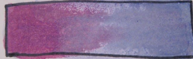
The last test is to blend two different color families. I applied the ink in act of the families by putting the tip of the marker down at the end of the rectangle and then "flicking" it outward toward the other end of the rectangle, allowing the tip to make lighter contact as it moves. The inks meet near the center of the rectangle, with lighter coverage from each marker, allowing the two inks to blend.

The results of blending on each of the card stocks were similar to the same-family blending, though I had more trouble with the Ivory card stock than I expected. The Bazzill Ultra-smooth white card stock worked the best by far.

LaBlanche not tested
Georgia-pacific
Bazzill Coconut Swirl
Bazzill Ivory
Bazzill White Ultrasmooth


For me, the Bazzill Ultra-smooth card stocks are clearly better for use with Copic markers than the other card-stocks I had available. My results may not be YOUR results, though. Every person has a different hand when it comes to using markers. SO be sure to do these tests on YOUR card stock when you are making the choice for your coloring needs.

But no matter what card stock you chose, you'll be sure to find it at FranticStamper. And Fran also carries a huge assortment of Copic markers.

Friday, February 10, 2012

Technique Thursday: Kansashi Templates


Sorry we are late posting this. Somehow the week got away from us.

Today we have a video on how to use the Clover Kansashi templates to make your own beautiful floral embellishments. Though the audio on the video is in Japanese, the video is wonderful, showing step-by-step how simple it is to make perfect petals for flowers. With these tools and your fabrics you will be able to make a perfect flower for your next project!


Check out the Clover Kansashi templates at www.FranticStamper.com

Wednesday, February 08, 2012


Hi everyone,

We've been back from CHA for a week now, and still digesting all the catalogs and orders we placed.

As usual, CHA was full of new products and our credit cards are maxed. :-)

We placed orders with all our regular companies such as: Graphic 45, Prima, BoBunny, Tim Holtz, Crate Paper, October Afternoon, We-R-Memory Keepers, Ranger, Clearsnap, Tsukineko, 7 Gypsies, Tattered Angels, My Mind's Eye, K&Company, Martha Stewart, EK Success, Inkadinkadoo, Marianne Designs, May Arts, Crafter's Workshop, Webster's Pages, Dreamweaver stencils, Northwoods, Penny Black, Hero Arts, Spellbinders, Sizzix, Darice, etc….

We also added a few new (to us) companies: Canvas Corp, Anna Griffin, JudiKins stamps, Studio Calico, WorldWin Papers, and Simple Stories. We also brought back some of your requested favorites: Die Cuts with a View (DCWV), Little Yellow Bicycle and The Paper Company.

Here are some highlights:
  • -Ranger is introducing a set of Distress Markers by Tim Holtz in a range of 37 colors (36 + opaque white)
  • -Also from Ranger, look for new colors of Ice Stickles and Liquid Pearls
  • -Tsukineko announced 12 new colors of their popular Memento inks
  • -Clearsnap has 6 new colors of Colorbox + 6 new colors of Fluid Chalk inks, as well as new smooch glitz
  • -We're excited to bring you a selection of rubber stamps from Judikins
  • -Graphic 45's two new collections should be here soon: Little Darlings and Olde Curiosity Shoppe
  • -We will soon be carrying the clear stamps from Marianne Designs in the Netherlands
  • -Tons and tons of gorgeous new ribbons from May Arts are coming in March
  • -We are expanding our selection of papers for the cardmaker, including shimmering cardstock, animal skin patterns and vellums coming soon
We're still unpacking and reviewing all that we bought. We're working hard to add products to the site as they come in too!

Hugs,
-Fran
www.franticstamper.com

Tuesday, February 07, 2012

Coloring Corner: Selecting Ink for Copic Markers


Welcome to our newest feature, Coloring Corner, which is replacing our regular Tip Tuesday feature (we will still offer tips from time to time, but not on a weekly basis.) The focus of the Coloring Corner posts will be coloring, with an emphasis on Copic Markers. As parts of this feature we will offer coloring samples, coloring tips, challenges, and more.

Today we would like to start with something very basic; ink selection. No matter what coloring media we want to use, we want to be sure that the ink we use to stamp or to draw is not going to run or bleed when we color.

One of the first things we did as part of the Copic Basic Certification was to learn to chose paper and ink suitable to the markers. The technique used is valid for ANY coloring media, though, and we would like to share our take on the ink portion of it with you now.

On a piece of standard white copy paper, draw a circle about an inch in diameter or stamp a simple open image as shown below, depending on if you will be drawing or stamping your image.


Next, use your coloring media of choice to color inside the circle or stamped image, up to but not touching the ink line (touching the line will potentially contaminate the tip of your media). Fully saturate the paper with the media (water for watercolor, Gamsol for colored pencil, or with the marker for Copic markers) you plan to use. I plan to use Copic markers, so that is what I will be sharing. (At first I was going to color my sheep gray, but then realized that in the photograph you would have trouble seeing the lines, so I switched to a pink tone. Please ignore the gray spot in the first photo.)

For the purposes of this article, I stamped my image with Memento, Memories, and Stazon inks. I next put the tip of my Copic marker a little distance from one of the lines of my stamped image and just held it there, allowing the Copic ink to saturate the paper. I made sure not to let the tip of my marker touch any of the lines.

Here are the three different samples:

Memento
Memories
Stazon


Check carefully for ink feathering from the drawn/stamped line outward from the circle or inward into your colored area. (Feathering is what ink moving on the surface of the paper is called; bleeding is what ink moving through the surface to the back side is called.) Feathering is a sign that the media of choice acts as a solvent for your ink, and that the ink will smear or smudge with that media; try a different ink!

Can you see how much the Memories and Stazon inks feathered in our samples? Obviously, given that amount of movement in the other two inks, the ink of our choice Copics is the Memento ink.

However, you may find that another ink works well for you, or you might be without that preferred ink sometime and need to pick an alternate. This method will assure your ink is suitable to your task. And no matter what your ink needs might be, you can find them all at FranticStamper.com.

Sunday, February 05, 2012

Sketch Sunday: February 5, 2012


Here is the card sketch for this week.


Isabelle Drouin-Vachon shares her take on the sketch with us this week. Isabelle chose to create the illusion of the basic shape of the elements with little banners rather than be literal with the oval. Nice effect, don't you agree?


Linda Phinney remembered that a sketch is just a starting point, and had fun rearranging the elements of the sketch a little to come up with this wonderful card.


Here is Jane Larsson's version. She, like Isabelle, got the oval shape by arranging elements to give that illusion. I think this is a playful and fun card; don't you agree?


And last but not least for today, here is a card from Jennifer Willis, who, like Linda, rearranged some of the elements of the sketch.


We hope you will give the sketch a try and share a card or two with us, too. Just email your photos to FranticStamperSketchPhotos@yahoo.com and we'll add it to this blog entry.